When most people hear the term, they might think of flashy animations, moving loading screens, headers bumping left and right, and the list could go on endlessly. However, microinteractions are much more than a mere visual element. They are far more concrete than typical animations, and far more useful than a visually moving elements driven by whim.
Microinteractions assist users in navigating the interface, making it more intuitive to use and thereby elevating the user experience to a higher level. They achieve this through short animations, sound effects, or even haptic feedback.
If we were to define it, perhaps it could be best put this way:
“A microinteraction is a small response triggered by a trigger (an action?) on the interface. In most cases, it's visual, but it can also be sound based. For it to occur, the user needs to interact with the interface, or the interface needs to prompt interaction.”
At first, it might sound complicated, but let's take a closer look:

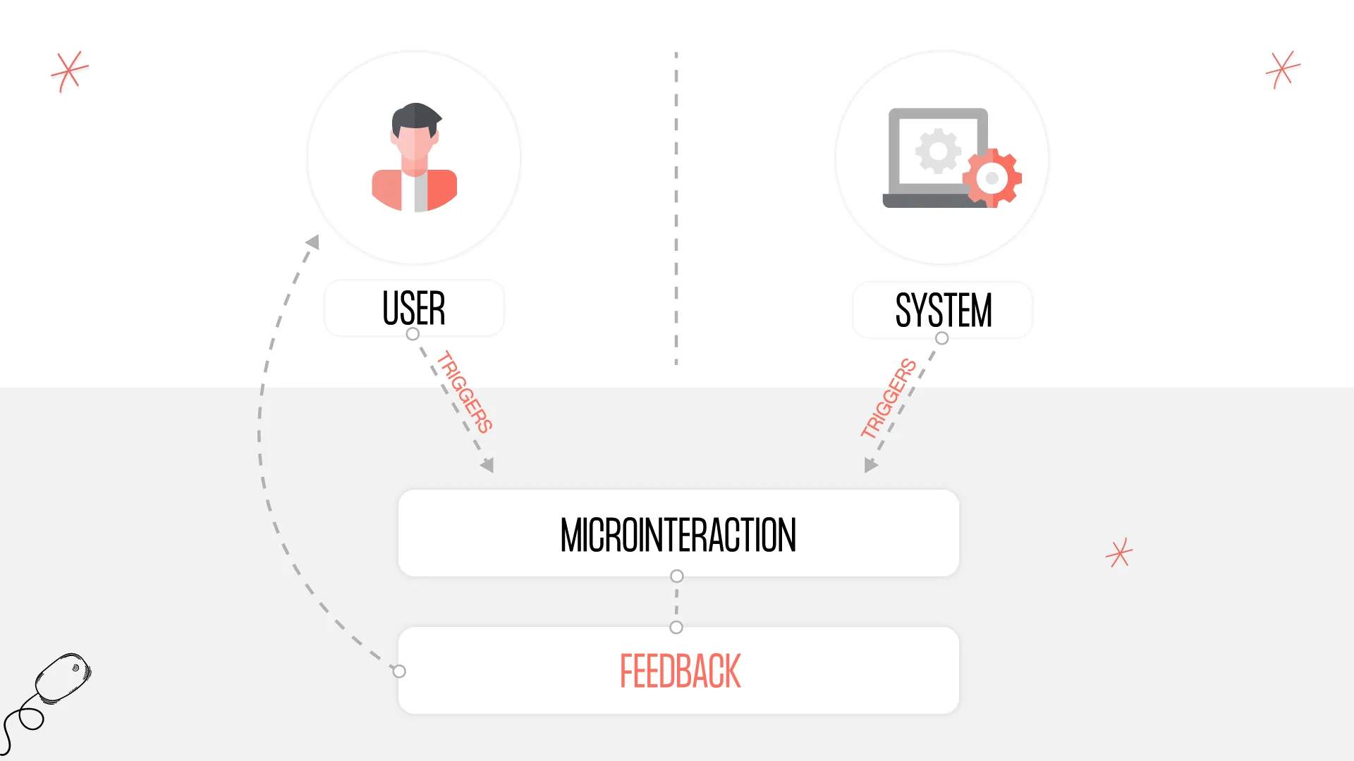
TRIGGER ➡ MICROINTERACTION ➡ FEEDBACK
These are the three components of a good microinteraction.
In every case, some triggering event (trigger) is necessary to initiate the execution of the microinteraction. Then the microinteraction must run and provide relevant feedback to the user.
Trigger can be provided by the user or by the system. However, without a trigger, we cannot speak of a microinteraction. This will become more important later when we discuss what distinguishes a microinteraction from a mere animation.
Let's look at a practical example:
When a user hovers their mouse over a button, the button's color changes. In this case, the triggering event is the mouse hovering over the button. The microinteraction is the change in the button's color, suggesting to the user that the button can be interacted with, not just a graphical element. This is the feedback.
Or imagine an email program. You write your email, click the send button, and the system plays a swooshing sound, emphasizing that the email has indeed been sent.
Trigger: Clicking the send button,
Microinteraction: Swooshing sound,
Feedback: The email has been sent.
Another familiar case is when a new message arrives in an application, and a red circle with a number appears on the application's icon. In this case, the trigger is the arrival of a new email, the microinteraction is the red circle with the number, and the feedback is that a new email has arrived.
So, we can use them in various different cases, but what are these cases exactly?
Feedback on the system's status:
- Loading screens (system is loading, not frozen)
- Sent email (swooshing sound or short animation)
- Characters typed indication (e.g., when entering a password)
Highlighting changes:
- Checkbox being checked (visually indicating that something has been selected)
- Toggling a switch (indicating that a different state has been set)
- New message received (red badge with a number)
Prompting action:
- Consent approval required (mandatory section highlighted on the interface, indicating that until it is accepted, the user cannot proceed)
- Guiding through a process (if the user waits too long during a process, indicate on the interface how they can proceed. E.g., the continue button moves/changes color, etc.)
After all these examples, we might be able to answer the question ourselves:
What distinguishes a microinteraction from animation?
“What requires user interaction and facilitates easier understanding is a microinteraction. What serves solely for visual experience is animation.”
That is, if we animate an element just for the sake of it, because we think it makes the page look better, it won't be a microinteraction.
Many of us surely remember the early 2000s when enthusiastic web designers filled pages with GIF animations, and so much was moving on the interface that it was hard to discern the actual content amidst the animations. This is not the aim of anyone, so let's handle self-indulgent animations with care!
Okay, but what about microinteractions? Can we overdo them? The short answer: yes, which is why here are some guidelines to consider when designing microinteractions.
How to design microinteractions?
- Use microinteractions with purpose; they should support the experience, not overshadow it!
- Something shouldn’t move just to look "cool." Aimless movement only confuses.
- Use short, purposeful animations that efficiently convey information.
- Microinteraction is also a design element; it should fit the brand identity and be part of the design system.
And perhaps the most important rule:
"Microinteractions don't replace careful design; a process/interface must be easily understandable, intuitive, and easy to use even without microinteractions. If the foundation is good, only then can we elevate the experience to a higher level with microinteractions."
Best wishes for good design!
Article produced by our subsidiary @works.